
|
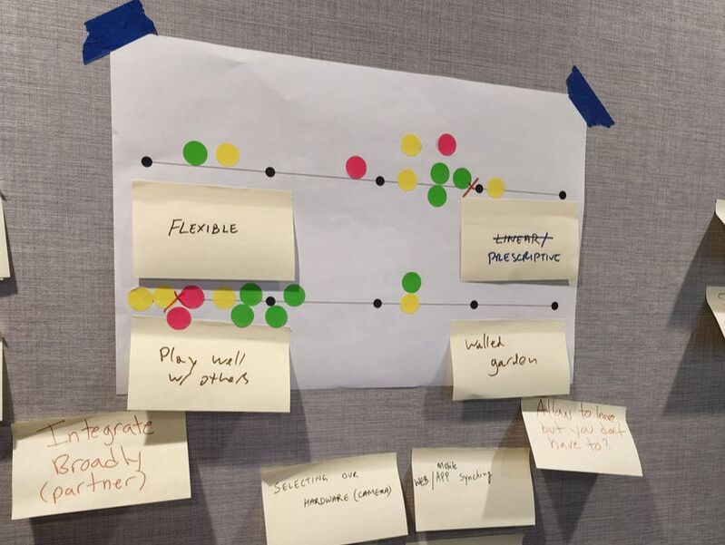
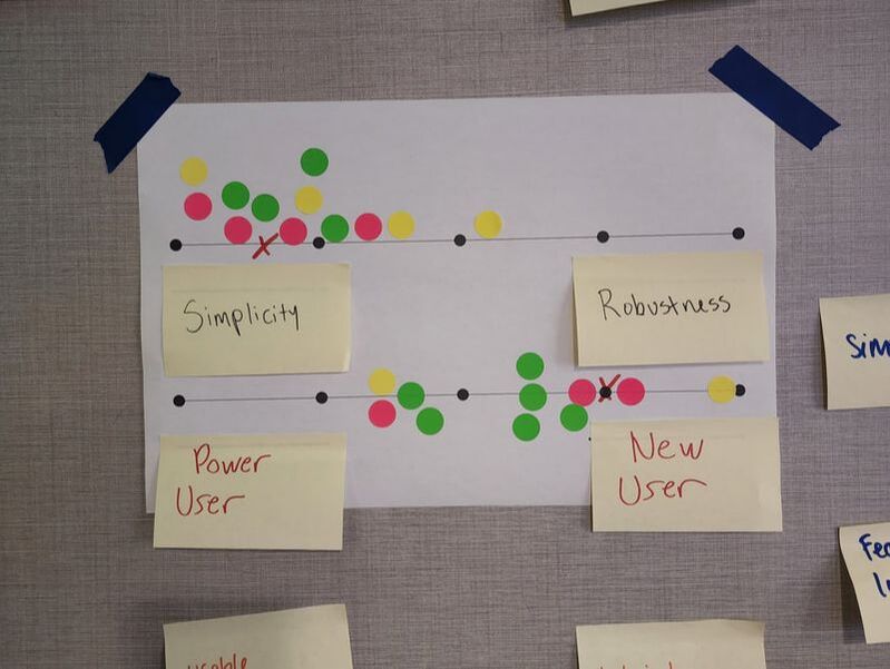
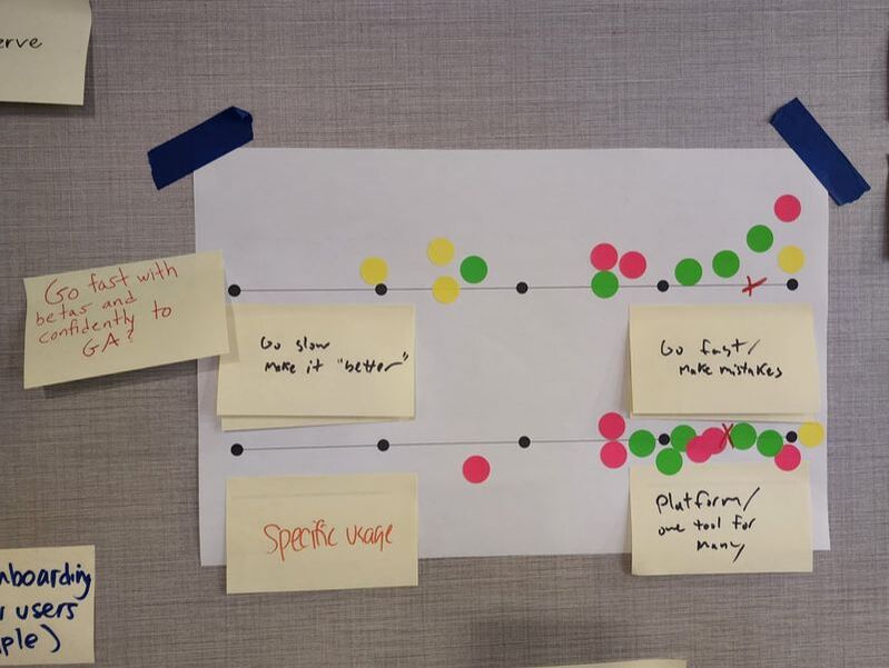
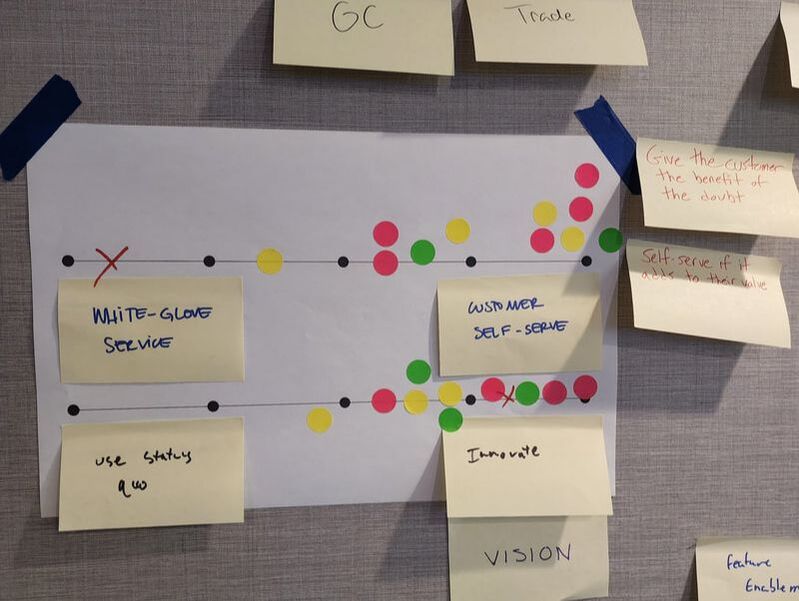
At OpenSpace, I quickly realized we needed a better way to scale our decision making and ensure that teams and product managers were empowered to make the best decisions without getting slowed down by questions or unnecessary meetings or buy-in. The main problem was that many of the decisions had long been centralized with a few executives and leaders. As the company grew, and as the product and engineering team grew, I saw that we needed a way to ensure that we could move fast without sacrificing on core principles that we all agreed on. But the key would be to agree on those key principles. First, as a product organization. Then as leadership and a broader company. So I led our team through several exercises (see the full presentation here) to determine where we were currently with our decisions, what we valued based on what we did, and where our most urgent problems were. 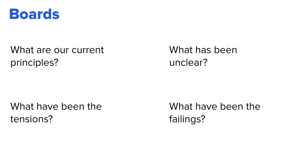 Once we identified the problems and tensions, we had a discussion about where those problems most frequently manifested themselves. This helped generate additional ideas from our group and got us thinking more about our product areas and the places where we would benefit most from guiding principles. From there, I asked everyone to take some additional time to write out the tensions they experienced, add any that they may have missed, and put those all on sticky notes so we could begin to decide what our principles should look like. 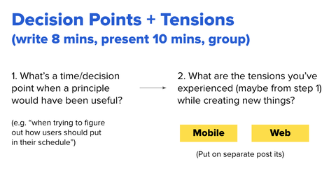 Plotting Tensions and VotingOnce everyone had a chance to write down their ideas, we put them on the wall. We took some time to group similar ideas and ensure that we all understood the notes that had been posted. Once we had our groups, we plotted opposite ideas on continuums. I wanted to force us to pick a side. For example, should our product be very simple and targeted to new users? Or should it be very advanced and created for those who are experienced. While it may be possible to have a product that can do both, it is very difficult. And when we're making product decisions, it is much better to have a clear idea for everyone, if we're going to keep our experience very simple or if we're going to be the advanced software for professionals. With that in mind, we created about 16 continuums with the tensions we wrote down. From there, I asked everyone to vote on each continuum, placing a dot where they thought we should focus. If our product should lean all the way to one side or the other, or if they were more in the middle. This gave us a plot of how everyone felt about our product and the principles we were forming as you can see:
Creating Product PrinciplesOnce we had used our dots to vote, I led the team in a discussion about each of the continuums. I asked if anyone who had voted on either of the extremes wanted to give their opinion, especially in those cases when there wasn't a consensus or there was an outlier. This allowed us to begin to shape the overall principles as we discussed the thinking behind each continuum and the voting of the team. I then took each of these and crafted our product principles and tenets. We used these with leadership to begin to get their input and acceptance in order to begin implementing the ideas as well as putting them into practice and testing them out. I continued to update these principles as we got additional feedback, experimented with them, and revisited them periodically as a team. Product Principles and Tenets
0 Comments
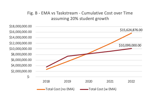
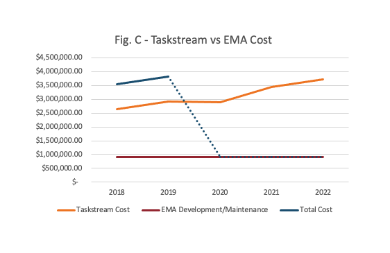
BackgroundFor years as Western Governors University grew, it outsourced much of the technology it used to third parties. This made sense initially as it focused on education. But it became clear to the university that in order to scale, it would need to bring in-house the technology. Not only to better serve its students, but because it was a different education model. The technology of higher education no longer served its needs, and it wanted to not only create software it could use itself, but could offer to other institutions who wanted to offer competency-based learning. With that in mind, WGU built out a product management organization, which I was among the first to come into and had the opportunity to help build and shape over my years there. In addition to building the product organization, I also had the opportunity to build out one of the key areas of the university: the assessment and evaluation software. For competency-based education, this is one of the most critical elements since testing knowledge is at the heart of competency. I led several teams within the Evaluation Department, and had the opportunity to imagine, design, and build out from the beginning one of the key pieces of technology for evaluation management. We affectionately called it EMA, or the Evaluation Management Application. And while the experience for users , especially students, was designed to be seamless, EMA was a massive effort that was a flagship product for WGU in many ways. EMA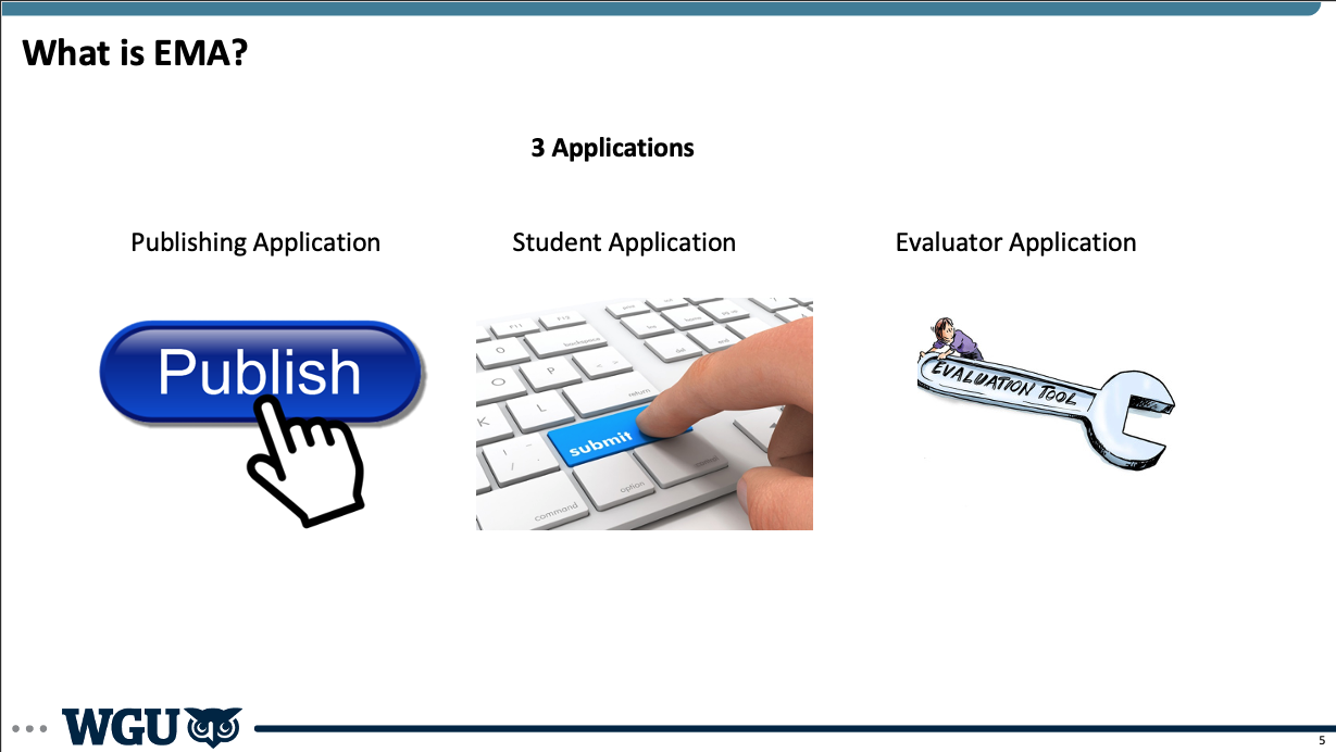 EMA was three applications in one. First, it was an assessment creation and publishing application. In order to have assessments available on the platform, we needed to create the ability for users, in this case faculty at WGU, to create and publish assessments to EMA. This was no small task though, since we had an entire department dedicated to developing assessments. So I had to work very closely with several teams to ensure we were creating the right tools to allow not only publishing, but different workflows for creating assessments. We started out with very basic functionality as we began, and then grew and added layers to the capabilities that EMA offered to faculty. Second, we had the student-facing portion of the application. This was fully integrated into the student portal and was seamless for students so they didn't have to go anywhere outside of WGU to find or submit their tests. This was one of the most important parts of the application early on because we wanted the student experience to be incredibly simple and intuitive from the start, even if we had to do a lot in the background to make that happen. Finally, we had the evaluation portion of the platform. This is where evaluators (a separate group of faculty) would come in to evaluate submitted exams, grade them, and send them back to students. Evaluation faculty was one of the largest faculty groups at WGU, and ensuring that we maximized their time was critical. When we began developing EMA, we started testing with just one exam, one class with 13 students, and a single evaluator. It was a good thing too, because we had to do a significant amount of work "behind the curtain" to make everything work and to learn, but with this learning we grew significantly over the subsequent months. 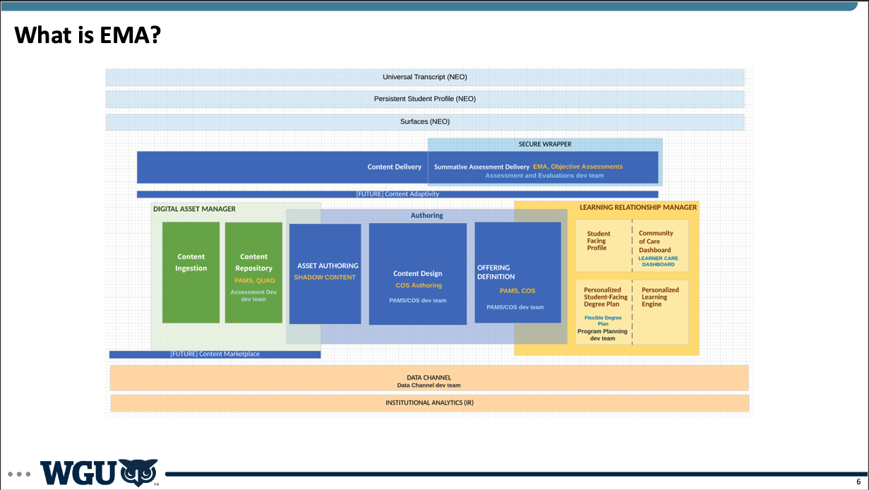 BenefitsThere were numerous benefits to the development of EMA. We knew early on that no other solutions on the market were built for competency-based education. So we knew that building a platform specifically for this purpose would benefit our university, our faculty, our students, and the industry. We also knew if we wanted to scale both as a university and help scale competency-based education, we needed to do this. We couldn't continue to linearly pay increasing costs as we grew. This was one of the key pieces of analysis I did early on. Because we had many stakeholders who were very skeptical of the need to create development teams, dedicate significant resources, and ultimately own internally all of this technology. Finance was chief among the skeptics. So I worked on initial analysis and then ongoing updates to show our progress.
DevelopmentWe developed EMA iteratively, as I mentioned before. We started out with a few students, a single evaluator, and manually doing much of the work behind the scenes to test out a lot of the processes and to make it work without doing too much development too early. We then got more colleges involved, more departments, more students, and more evaluators. And the complexity scaled significantly as we grew. I could dive into many stories of lessons learned and issues we had to overcome, but I'll touch on just a few here. Early on, we made the decision to build using a Cassandra database. Cassandra is a non-relational database. It is good for many things, and good if you have the expertise to maintain it. This was an architectural decision we made based on the expertise we had at the university, but turned out to be a mistake. A non-relational database was not right for our purposes, and our Cassandra expert soon left, leaving us without the necessary expertise to properly maintain the database. As we grew and scaled, we began to notice performance issues. As records were being deleted, it left a "tombstone". We didn't realize that we needed to clean up these tombstones in the database, which led to further problems. We also were part of a broader organizational effort to migrate to AWS. Given our lack of team expertise in non-relational databases, the need to move to AWS, the desire to better manage our application and database with a relational database, we decided that before we fully scaled up, we should move from Cassandra to Aurora on AWS. This meant a re-write of most of our application and a full migration. We had to pause all of our feature development work. I led the team on discovery to flesh out the details and estimate the scope of work, as well as worked with stakeholders to help everyone understand the need for the architectural changes and the benefits once they were done. We estimated, created the plan for work, and began. As with all projects, it took longer than our optimistic plan, but aligned with our conservative plan (or maybe with Hofstadter's Law), but we completed the move to AWS and our move to an Aurora database. Additionally, we created a seamless user experience for faculty and students. Students no longer had to submit their exams through an outside portal or vendor, but could access everything within the WGU student portal. 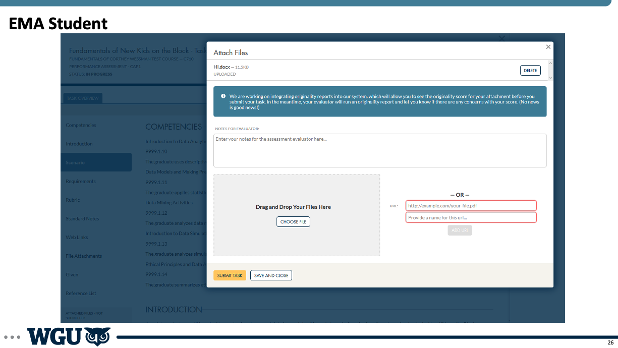 For faculty, we created a more seamless interface that worked the way that they worked. Rather than forcing them to conform to an application, we created an application and platform that worked with them, helping them save time and mental energy, getting them through their work more quickly. 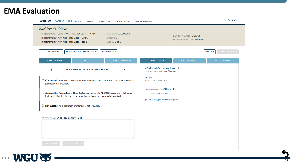 LaunchThe rollout and launch of EMA to all of WGU was a multi-phased process. It involved working with every department at the university in some way, given that it touched everyone at some point. I initially had to determine which courses and programs made the most sense to focus on initially. And from there, determine how to get those assessments, students and faculty onto our platform. This involved incredible buy-in from across the university, especially as the number of courses, students, and faculty grew. 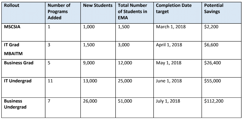 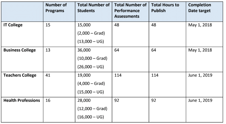 I faced competing pressures as we built and launched. There was the pressure to move quickly, get our new platform out, and start to realize the savings and the UX benefits. But we also had to balance that against the changes we were asking everyone to make, especially to longstanding processes that were not easy to adjust. While we love to move quickly in technology, that isn't the case in other disciplines or departments, and we have to be conscious of that. I had to work closely with many groups, and we made lots of adjustments to our timelines and rollouts as we went. 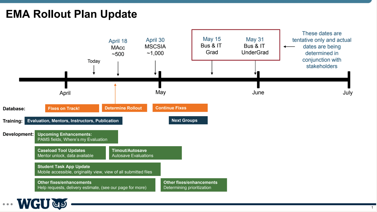 But we did hit our key goals of launching to the whole university on schedule, and eventually getting other universities onto the platform as well.
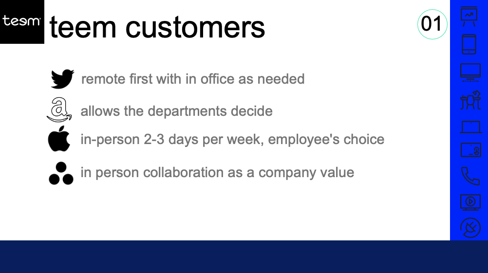
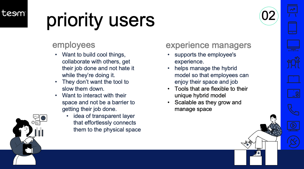
BackgroundAs Teem was acquired first by iOffice and then by SIQ, it was critical we establish a cohesive product vision and strategy to define Teem's positioning amid the market, competitors, and the portfolio of companies within our organization. So I created an analysis of user and market needs, Teem's positioning, and a vision and strategy for our product going forward. I worked closely with other members of our product, design, marketing, and engineering teams, and then presented and socialized this information more broadly to continue to gain support and help others both add to it and understand the direction we were looking to take Teem and the product. ProcessMarketFirst, it was important for us to understand the market and the context for our company and our product, especially as we were coming out of the pandemic and more companies and employees were returning to the office in some way. 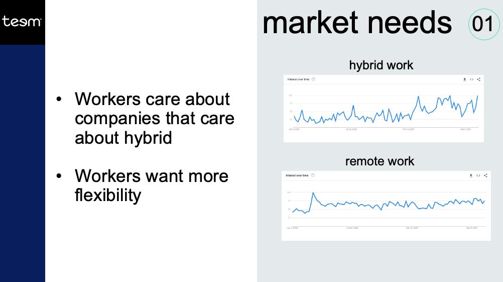 UsersNext, I focused on our users, their key needs in the immediate-term as well as the longer-term. It was important for us to consider the current situation, which was Covid-19 and a gradual return to offices, but also the longer-term situation which would likely see a complete mix of remote, hybrid, and in-office depending on the needs of the company and the employees. Competitors
I also looked at the history of Teem, its place in the market, and its competition both directly as well as from other incoming solutions. Teem was built from employee experience first and then moved toward administrative tools. Unlike other competitors expanding in desk and room booking, Teem was built for the user in mind and was easier and more intuitive to use than other offerings on the market. This was an important consideration because Teem was moving more into administrative tools while companies that started out more focused on admins were moving more into the employee experience. 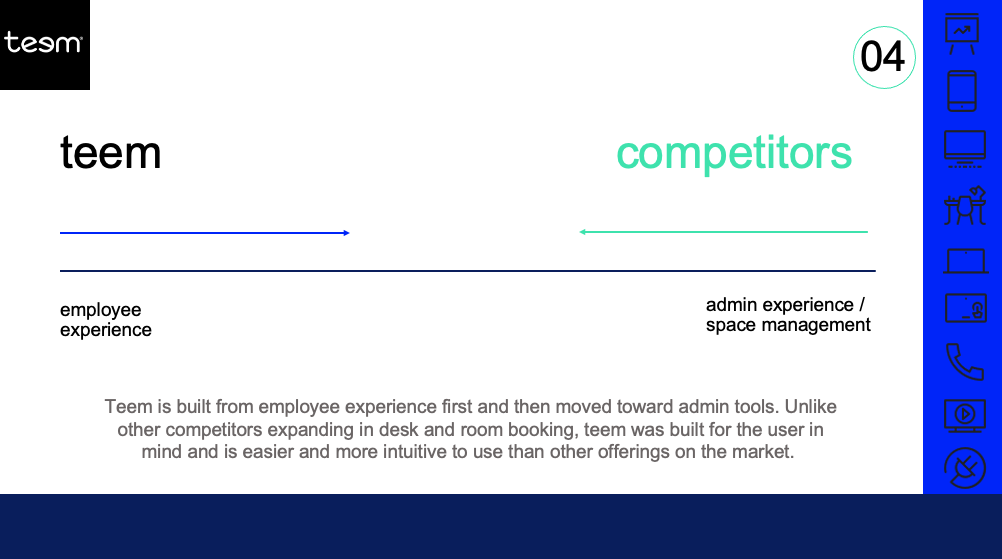 ChallengesFinally, I reviewed the challenges that Teem was facing from a company standpoint, a product standpoint, and a market standpoint. 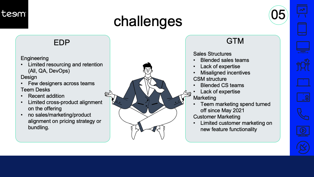 ResultVisionOnce we had thoroughly reviewed the the market, our users, our competitors, and our company, I crafted a product vision that could address the key needs of users, utilize our strengths as a company and positioning in the market, and focus our efforts on creating the most important products, features, and experiences for the new work environment. 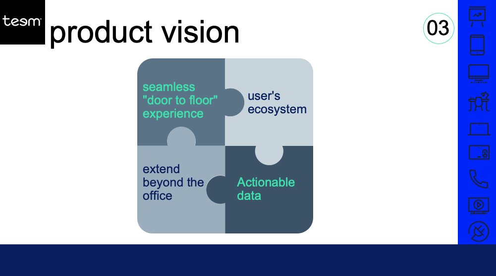 PositioningIn addition to the product vision, I also helped craft our product positioning. This was an important aspect given that we were part of a larger group of companies within a private equity portfolio and wanted to focus on the correct positioning within that group of companies and within the broader market. 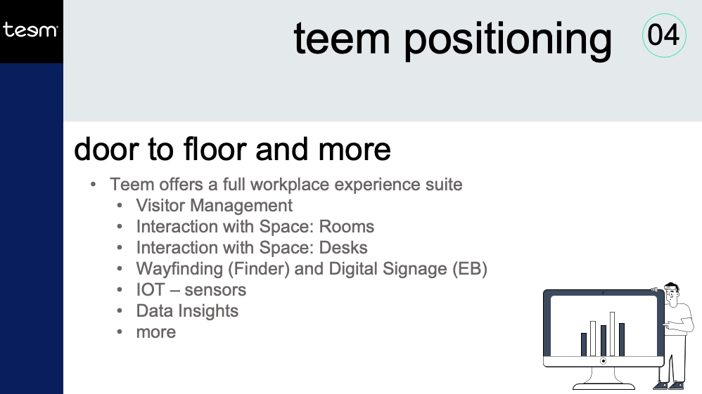 StrategyFinally, in order to achieve the vision, I crafted a product and company strategy that could begin to guide us in our prioritization of existing and new product development. We needed to focus our efforts on the right things in the right way, and this was the strategy for that. 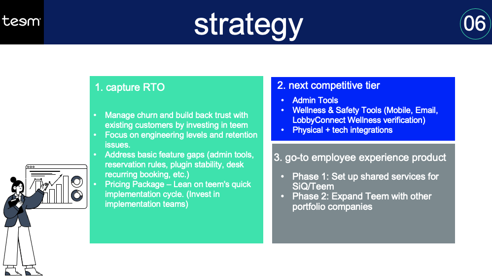 With a vision and strategy in place, as well as an understanding of our positioning, we were able to really focus our development efforts and prioritize new features and products correctly. This was the beginning of a much firmer and better direction for Teem.
At Clearlink, our product organization worked closely not only with the broader organization, but also worked closely with marketing partners in order to build new products, test ideas, and drive better business outcomes. As part of this, we were often running A/B tests of marketing changes. We worked with our partners to create new marketing copy and then test out the changes over certain periods of time to see what images or phrases would work best for their sites. But as I helped build out the product and UX organization, we wanted to expand from just running A/B tests on copy and images and use the same methodologies to experiment with user flows and the actual experience of the users on the sites. This was a bigger deal, both for our partners and for our teams because it involved more work to create the changes, as well as more buy-in to allow us to run experiments not just with language or images, but with the actual experience of users. But we were adamant we could improve the user experience of their sites, helping to improve traffic and drive additional conversions. So we designed and created a new user flow for one of the sites that we targeted first. This was an online retail site that gathered information and then moved people to either sign up online or call a number to sign up. Our hypothesis was that we could simplify the user flow, eliminating over two-thirds of the steps to get the user from first action to a purchasing decision, and increase conversions by requiring less of the potential customers. 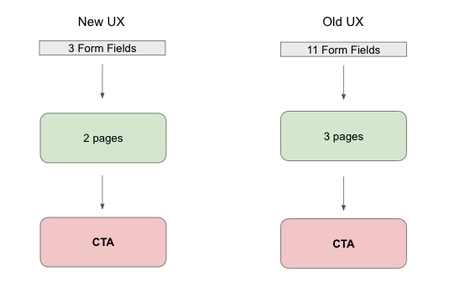 I worked closely with our partner to overcome a number of obstacles and concerns, and we created prototypes, reviewed designs, and prepared stakeholders for the changes we were creating. (This may seem like overkill for some good UX changes, but we were dealing with a large telecommunications company that didn't like change and didn't like to move fast or try new things, hence the need to really get everyone on board) Launching the TestWe ran a 2 week test of our changes versus the unchanged site. We randomly assigned visitors to one of the two sites, but also tracked unique users and attempted to give them the same experience if left and returned. This specific site traditionally got thousands of visitors over the timeframe we were targeting, so we were confident in getting enough traffic for a meaningful result. We used many of the same targets for other A/B tests that we ran for other marketing purposes, including a full testing period and appropriate confidence intervals to test for statistical significance. It's important to run a test for a full length of time, because stopping a test short can lead to noisy results or incorrect conclusions. This was certainly a temptation, especially with a partner who had reservations about so many changes and also would want to stop using one of the sites as quickly as possible if the other was showing significant good results comparatively. As you can see from this image, there is noise in data, and stopping an A/B test early can lead to making the wrong decision, which is something we reminded everyone of as we tested. 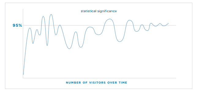 The ResultsThe results of our UX changes were even better than we expected. We had set a p-value of 0.05, but got a p-value of 0.01, suggesting statistical significance beyond random chance as we saw conversions almost double over the time period on our site with the UX enhancements versus the original site.
This was a validation not only of the changes we made, the designs we created, and the work we did to get the partner on board with the test, but also more broadly validated the work I was doing within the product and UX organization. UX changes--designing better experiences and not just nicer pictures or better wording--has a significant impact on the overall user experience and ultimately the business value. I continued to use this as an example of the value of product and UX as we worked internally as well as with other partners, to help everyone understand how and why we can focus on the users and why taking time to design the whole experience adds significant value. I believe wholeheartedly in the power of quantitative and qualitative data. I often view it as a funnel where quantitative data and point us to issues or opportunities, and qualitative data helps us dive deeper in order to create compelling solutions. BackgroundOnce HealthEquity HSA members have saved a certain amount of money in their health savings accounts, they can invest the additional or excess funds from their HSA in a variety of mutual funds. As a product team, we knew from our analytics that a significant number of users didn't complete the investment onboarding and that we needed to fix this to grow our investment users and help all members maximize the benefits of their HSA. ProcessInvestment Platform at HealthEquity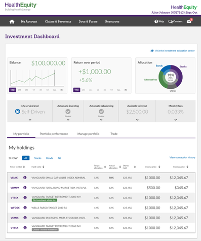 I used qualitative and quantitative data to create a significantly better investment onboarding experience at HealthEquity. When I came into the role, we knew that the investment experience was clunky and outdated. But didn’t know much beyond that. The company wanted to make it better, but didn’t know where to focus, hence my role. I started by analyzing the user flow from the instrumentation we had (which thankfully, was pretty good). I noticed a couple things, like a 50% drop of at one point in the onboarding process, and another point where around 3/4 of the users who made it there fell out. That gave me great context for diving deeper. I started by watching actual users go through the investment onboarding flow without interfering at all. I wanted see and understand the process from their point of view. Like the data showed, there were drop-offs at a choice between several investment options, another at the selection of investments, and finally toward the end before completing. So I started to ask “why”. After a series of interviews, I had a much better understanding of the problems user were facing. This included being overwhelmed by the choices, unfamiliarity with investing, or just fear of pulling the trigger. But I didn’t stop there. With that understanding, I worked with our UX team to create new user flows. We mocked them up and I put them all into Invision so we could test them with users. I went out and spent several days onsite with customers having them walk through our mockups. We learned that we had made the process better, but still hadn’t solved all the issues. One key problem was that we presented users with too many choices too early. Specifically, we asked them to pick between three options for investment guidance right at the beginning: Auto Pilot, GPS, or Self Driven investment. 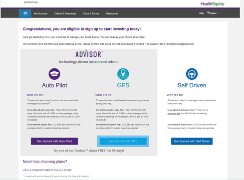 SolutionsAt that point I had the epiphany to radically change the flow even further. Rather than having three options at the beginning, causing users to segment themselves into specific buckets before they fully understood their preferences or own investment needs, we needed to guide them. This meant simplifying the choices at each step, and segmenting users along the way to guide them through the process and change the pricing structure. 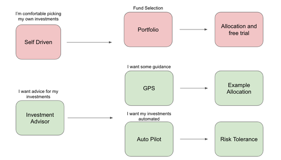 This required buy-in from a number of groups, including our investment team, sales, marketing, etc. So I made the pitch and showed them the data from our current users as well as the feedback from interviews. This helped everyone understand the need for pricing changes and a simplified process. And we moved forward with it, doing a few more testing sessions and then releasing the first iteration. We moved to simplify to investment flow as shown below. Rather than multiple screens and steps, we consolidated the decisions and guided users along the right path. 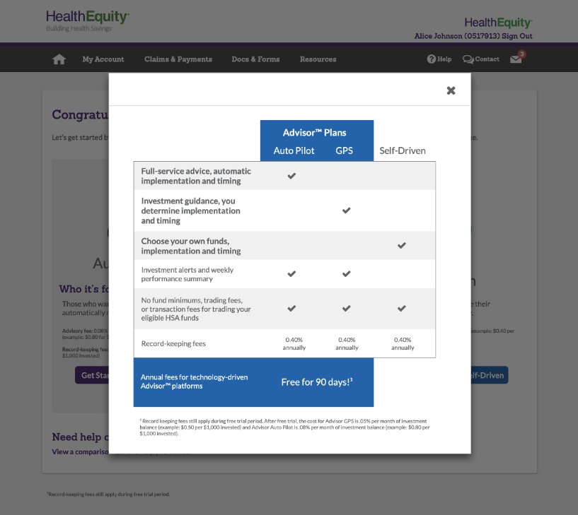 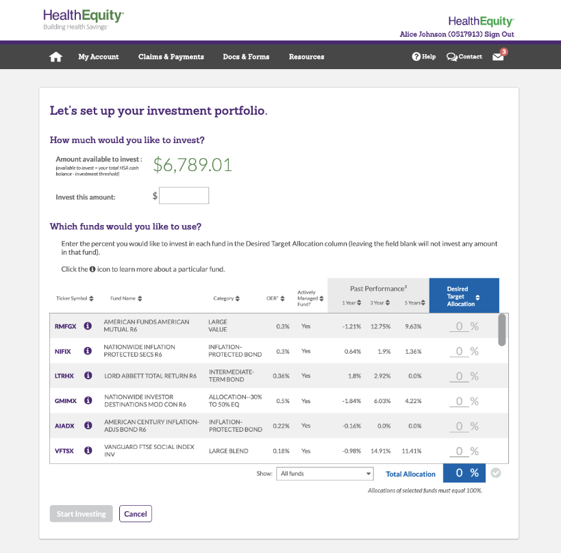 ResultWe saw an initial increase of adoption of 400% as users were able to more easily complete the onboarding flow. We also saw an initial increase of initial investments of 25% as fewer users dropped out of the investment process and got their HSAs invested.
|
AuthorMy personal musings on a variety of topics. Categories
All
Archives
January 2023
|
 RSS Feed
