|
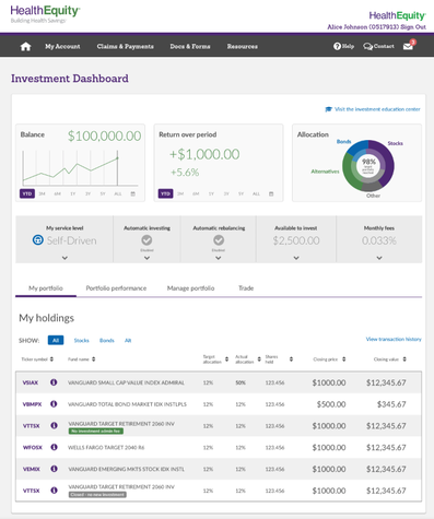
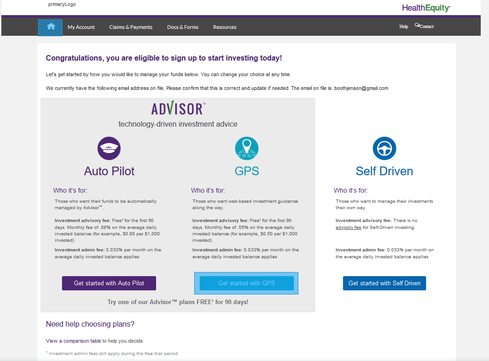
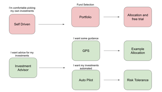
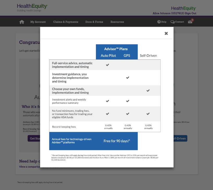
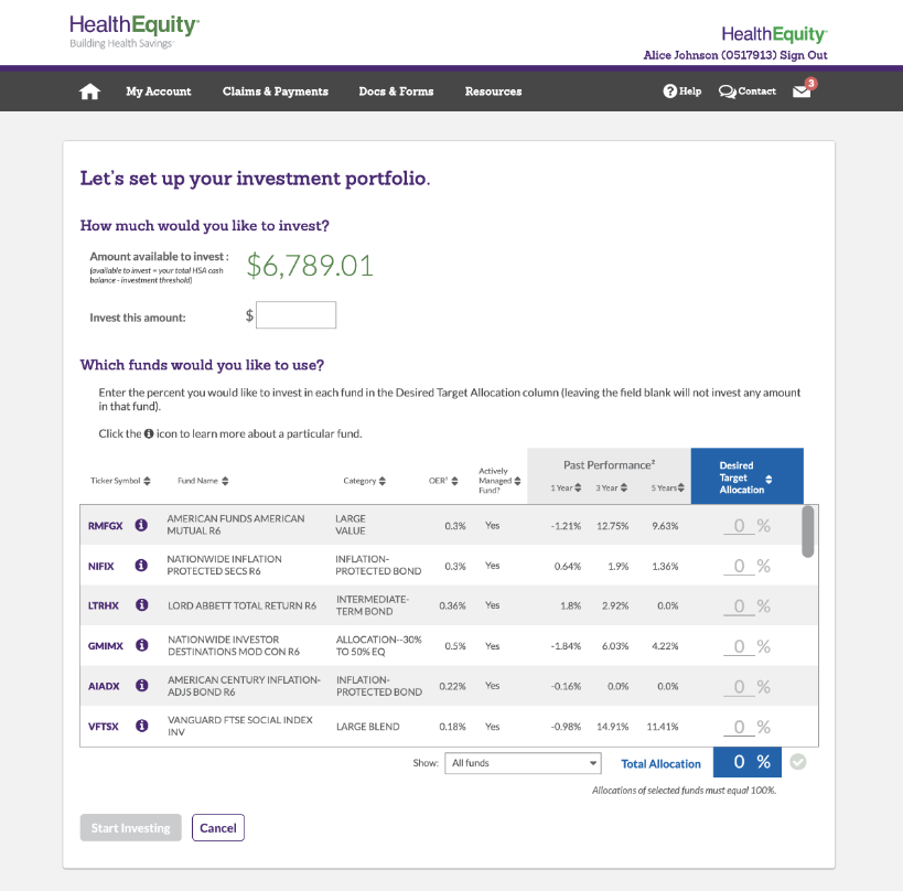
I believe wholeheartedly in the power of quantitative and qualitative data. I often view it as a funnel where quantitative data and point us to issues or opportunities, and qualitative data helps us dive deeper in order to create compelling solutions. BackgroundOnce HealthEquity HSA members have saved a certain amount of money in their health savings accounts, they can invest the additional or excess funds from their HSA in a variety of mutual funds. As a product team, we knew from our analytics that a significant number of users didn't complete the investment onboarding and that we needed to fix this to grow our investment users and help all members maximize the benefits of their HSA. ProcessInvestment Platform at HealthEquityI used qualitative and quantitative data to create a significantly better investment onboarding experience at HealthEquity. When I came into the role, we knew that the investment experience was clunky and outdated. But didn’t know much beyond that. The company wanted to make it better, but didn’t know where to focus, hence my role. I started by analyzing the user flow from the instrumentation we had (which thankfully, was pretty good). I noticed a couple things, like a 50% drop of at one point in the onboarding process, and another point where around 3/4 of the users who made it there fell out. That gave me great context for diving deeper. I started by watching actual users go through the investment onboarding flow without interfering at all. I wanted see and understand the process from their point of view. Like the data showed, there were drop-offs at a choice between several investment options, another at the selection of investments, and finally toward the end before completing. So I started to ask “why”. After a series of interviews, I had a much better understanding of the problems user were facing. This included being overwhelmed by the choices, unfamiliarity with investing, or just fear of pulling the trigger. But I didn’t stop there. With that understanding, I worked with our UX team to create new user flows. We mocked them up and I put them all into Invision so we could test them with users. I went out and spent several days onsite with customers having them walk through our mockups. We learned that we had made the process better, but still hadn’t solved all the issues. One key problem was that we presented users with too many choices too early. Specifically, we asked them to pick between three options for investment guidance right at the beginning: Auto Pilot, GPS, or Self Driven investment. SolutionsAt that point I had the epiphany to radically change the flow even further. Rather than having three options at the beginning, causing users to segment themselves into specific buckets before they fully understood their preferences or own investment needs, we needed to guide them. This meant simplifying the choices at each step, and segmenting users along the way to guide them through the process and change the pricing structure. This required buy-in from a number of groups, including our investment team, sales, marketing, etc. So I made the pitch and showed them the data from our current users as well as the feedback from interviews. This helped everyone understand the need for pricing changes and a simplified process. And we moved forward with it, doing a few more testing sessions and then releasing the first iteration. We moved to simplify to investment flow as shown below. Rather than multiple screens and steps, we consolidated the decisions and guided users along the right path. ResultWe saw an initial increase of adoption of 400% as users were able to more easily complete the onboarding flow. We also saw an initial increase of initial investments of 25% as fewer users dropped out of the investment process and got their HSAs invested.
0 Comments
Leave a Reply. |
AuthorMy personal musings on a variety of topics. Categories
All
Archives
January 2023
|

 RSS Feed
